- Web design and development — identity, system and static site
- 2026
- Astro · Tailwind CSS · TypeScript · React
Where it came from
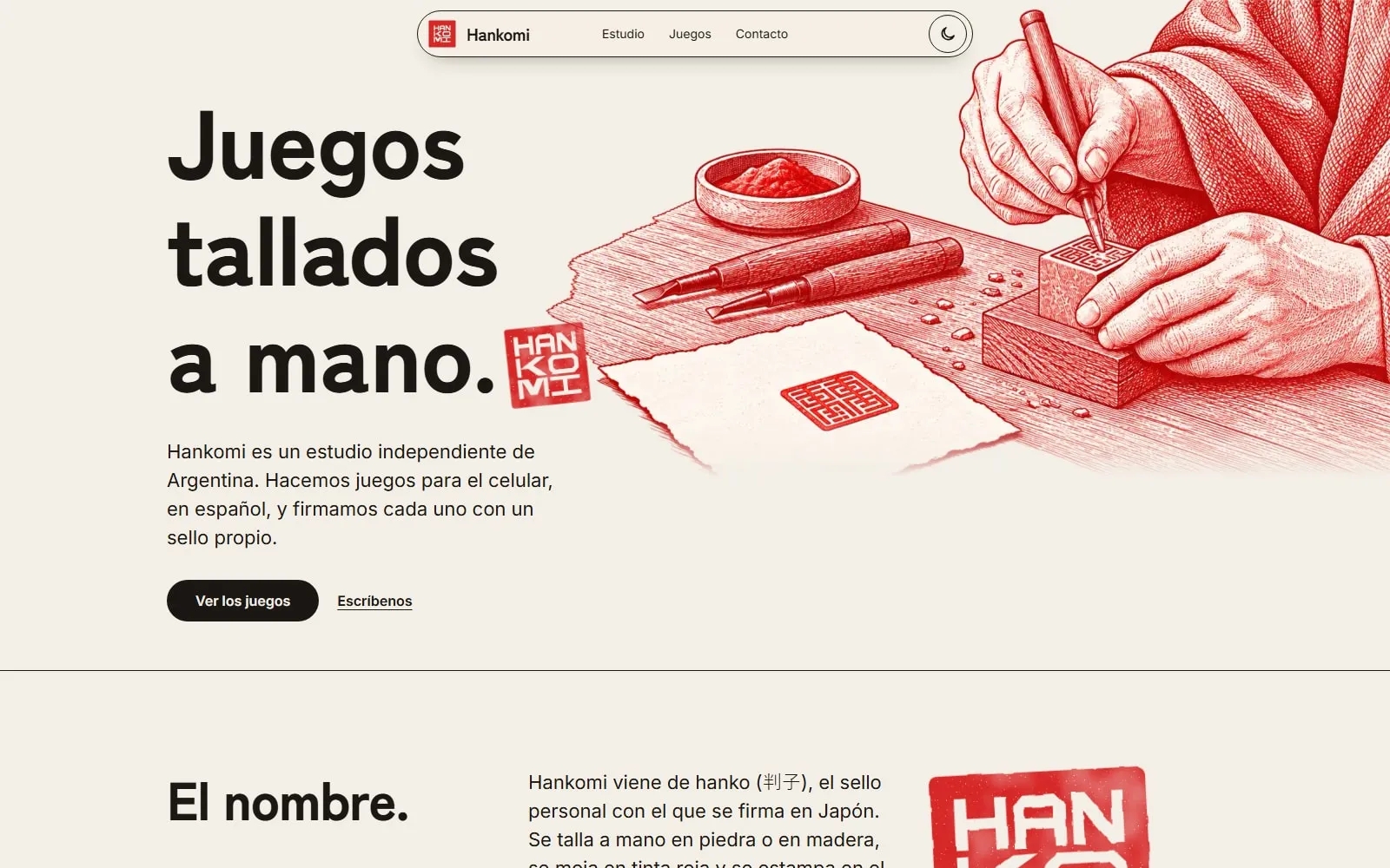
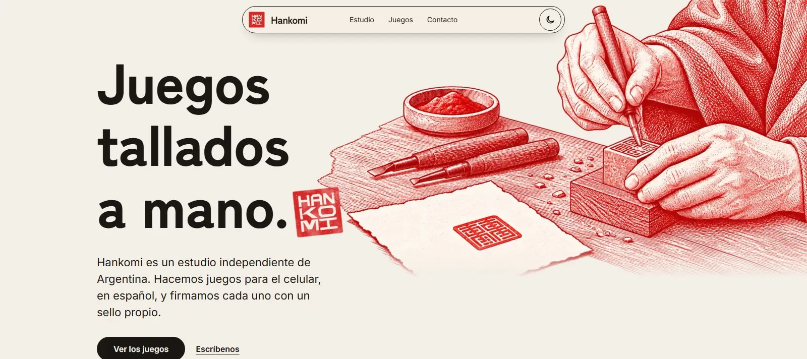
Hankomi is the website for an independent studio from Argentina. I designed and built an editorial home for the studio, its way of working and its catalogue of games.
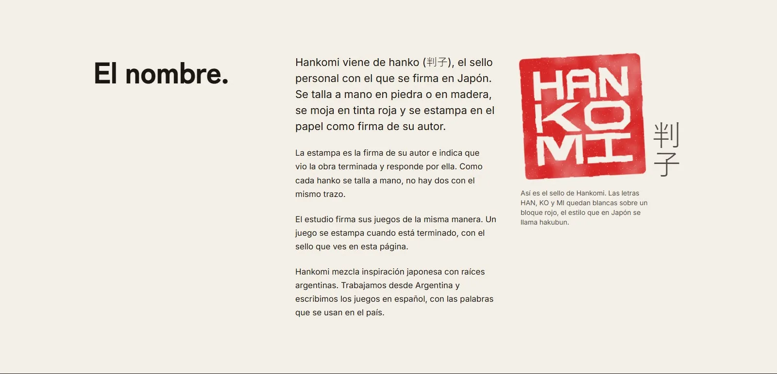
The identity starts with the seal that signs every game. The hero uses an engraving of hands carving a hanko, supplied by the studio, and the rest of the system returns to that idea through the red seal, paper and ink. The name is explained on the page through hanko (判子).
The brief
The design problem was keeping one voice while the site changed scale: from the studio hero to the explanation of the name, from principles to individual game pages. The answer was to treat it as an editorial montage rather than a set of separate landing pages.
In practice:
- Navigation, the seal and the colour tokens make the studio recognisable throughout the journey.
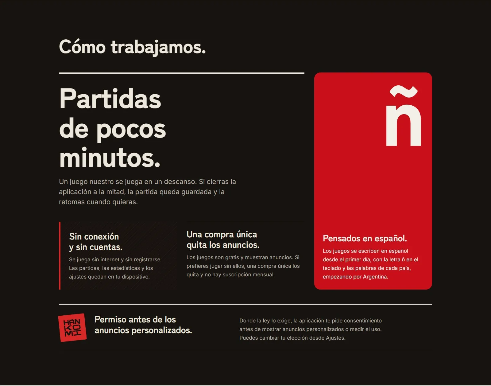
- The principles and process sections use different compositions — rules, panels, cards and a bento — without breaking the typographic rhythm.
- The Silbix page belongs to that system as its own page and visual language within the site.
The method
I built it as a static site with Astro, Tailwind CSS and TypeScript. React is
integrated to render components during the build; the configuration uses no
client:* directives, so no React runtime is shipped to the browser.
The visual interface is concentrated in the buril.css tokens: paper, ink,
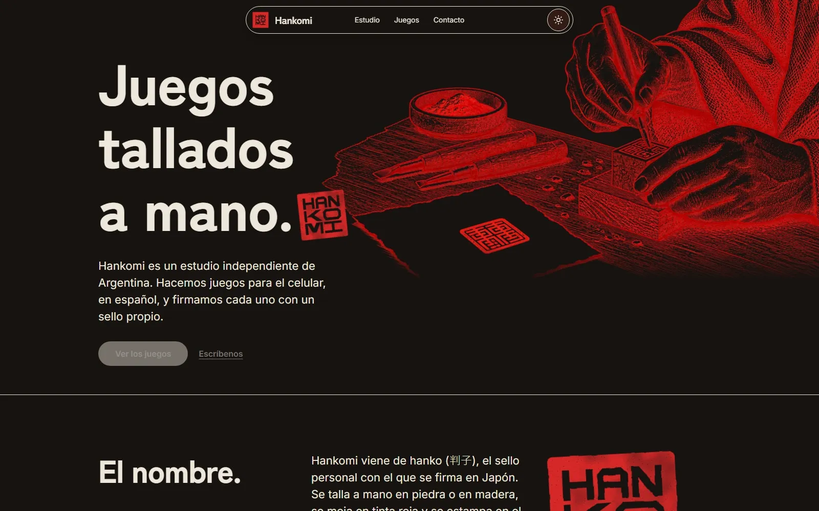
vermilion, night and their contrast relationships. The theme follows the system
preference until a visitor chooses otherwise, and that choice is persisted. The
hero engraving keeps light and dark WebP variants; the seal is implemented as
SVG, with a variant that adds the irregular texture of a stamp.
How it stands
Hankomi is live at hankomi.com: a studio website with a clear entry point, a narrative about the name and principles, a readable process and room for its games.
Problems and solutions
The site had to introduce the studio and its games without making every page feel like it belonged to a different product.
I organised an editorial identity around paper, ink and seal red: shared navigation, assertive type, fine rules and a mark that returns in the hero, the name section and each game's pages.
The same narrative had to hold together across a long page, with studio, principles, process and games read as one continuous story.
I built a responsive composition of editorial blocks: a visual entry, content rows, principle cards and a process bento. The content order also stays intact on small screens, while each game gets its own entry within the site.
The visual language needed to work on light paper and in a night reading mode without duplicating the interface or losing the seal's contrast.
I defined Buril tokens for paper, ink, night and vermilion, then tied the theme to the system preference and a persisted visitor choice. The hero engraving uses light and dark variants, and the seal is drawn in SVG with a stamped texture.